I read Huffington Post’s recent article about Times New Roman and resumes with professional amusement. As a resume writer, I come across 5-10 resumes every week from prospective customers that are written 100% in Times New Roman. It’s not a mystery why this is the case – it’s easily readable, universally compatible on computers, and is as close to a “default font” as exists in 2015. The problem? It’s almost impossible for your resume to stand out using Times New Roman – there’s just too many resumes that look the same.
My recommendation? I love Garamond – it’s a serifed font like Times New Roman, but different enough that it stands out from the horde of job seekers relying on TNR. You might remember about a year ago, when a teen made news declaring that the federal government could save hundreds of millions of dollars by switching to Garamond (his logic wasn’t 100% on the money, but at least it made for a nice story).
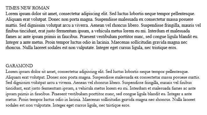
As you can see in the sample above, Garamond appears slightly smaller and thinner than Times New Roman at the same font size – creating a more airy feel that I prefer to use for many clients. It’s a classic font (almost 500 years old) that conveys a sense of tradition and elegance with its thinner and more rounded serifs, and saves space (about 7% compared to Times New Roman at the same font size).
Bottom line, it’s a solid choice for your resume that looks different enough to stand out from the crowd.
Recent Comments